19th Century Paper Dolls


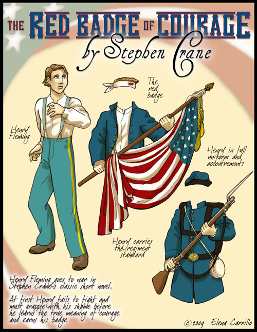
I'm a little disappointed with myself. I didn't have the courage to paint this doll after I'd inked it. But I have to send it by the 15th and so I had to finish it, and, well, here it is, finished. I colored it on the computer with Adobe PhotoShop and boy-o does it look slick, but it's really not what I was aiming for when I started it (as usual, click on the image for a slightly larger version so you can see some details).

I really had just meant to work on the lettering and whatnot (which I had intended all along to do on the computer, but once I started, I couldn't resist ~ and I knew it would just be simpler than fighting with traditional media and my horror of colors. And if I made a mistake I could just redo it with the click of my Wacom pen. It's very hard to resist that kind of flexibility.

I don't hate the final results. I think it came out just fine. I only wish I'd had the courage to do it as I wanted to instead of resorting to what's easy. The sad thing is, I'm sure it's all the more impressive for me having done it with the computer than I could have ever made it look in paint ~ at least posted online like this. Holding the real thing in my hands, paint is infinitely more wonderful. And now I worry that I have consigned Henry Fleming to a permanent state of black and white mere outline on the page because the chances of me going back to this project now that it's done are pretty much nil.  Sorry about that Henry.

Here's hoping I'll get work done on other dolls soon.


Comments

Wed, 13 May 2009 00:26:47

Well, I certainly understand the feeling of not doing something the way you "wanted" to do it and ending up doing it the "easy" way. I feel that way every time I finish something, glance at my colored pencil collection, think about using it and end up reaching for the black ink pens rather then the pencils. I tend to think (though this might just be because my rendering in Photoshop is still rough) that paints have a depth even digitally that is rarely there in Photoshopped work- though I do certainly think the piece is very impressive. The flag is especially nice. It doesn't have that overly bright look I seem to always get when I try to color something in Photoshop.

Also, this has made me realize I haven't ever actually read the Red Badge of Courage. Maybe I should get around to that and now I have paper doll inspiration. I can see it now- Paper dolls making people read classics that weren't forced on them in high school. :)


Fri, 15 May 2009 13:35:24

You should definitely read the book!

It's always a struggle (taking short cuts or opting out on more challenging choices). I think part of why I joined OPDAG (and why I started this blog!) was because I wanted to challenge myself more, but clearly I am stubborn mule.

: D


Sat, 16 May 2009 11:22:18

I draw in black and white cause it's faster and easier for me then any other choice at this point. I think it's okay to take short cuts sometimes as long as you experiment at other times. And if the blog helps you practice more it's effective. It can be scary though to try to color something you've painstakingly inked knowing it might mess it up. A water color artist I know likes to xerox her work and then rough paint it. The xerox lines don't smear when paint is applied and if she messes up, then she's just less one copy rather then having ruined the original piece. Kinda creates a comfort level.


Michele

Fri, 11 Sep 2009 16:50:12

Well, I just saw this! I love it! I looked your blog up, after seeing this in the new OPDAG! I think it turned out wonderfully, it's one of my favorites in this issue, and that includes my own, LOL! It is one of my favorites novels, too! So, just wanted to say, LOVE IT!


Sun, 13 Sep 2009 10:38:03

Hello Michele and thank you!

Oddly, I haven't received my copy yet, so I have no idea what it looks like in the OPDAG, but I'm glad it caught your eye! Thank you for visiting ~ I'll be sure to look for your doll whenever I finally get my copy!

: D


Leave a Reply